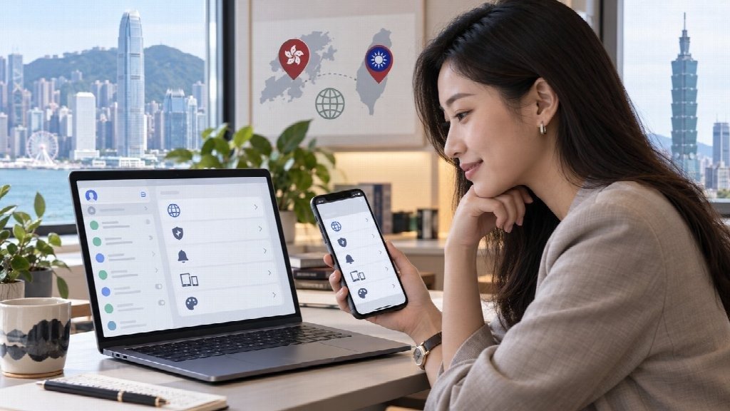
A user opens an English-language tutorial on a laptop while the messaging app on their phone is set to Traditional Chinese. The guide says to select one menu. The phone uses a different label. The screenshot looks unfamiliar, and the same setting appears somewhere else on the desktop version.
Nothing is necessarily wrong with the app or the translation. The problem is that the instructions, interface language, platform, and software version do not quite match.
This is where localization becomes more important than simple translation.
Good localization helps users understand not only what interface text means, but also how a feature fits into the way they actually use the product. For messaging apps, that can affect everything from finding privacy controls to understanding notifications, device sessions, storage settings, and help documentation.
Translation Is Only One Part of Localization
Translation answers a relatively narrow question: how should this text appear in another language?
Localization has to answer several more.
Does the terminology make sense to the people who use it? Does the help documentation use the same language as the interface? Do screenshots match the current product? Does the mobile version organize the same functions differently from the desktop version?
Even a technically accurate translation can create friction if those pieces do not line up.
Consider a settings guide that tells users to open a section called “Privacy and Security.” A localized interface may use a shorter term or organize the same controls under another heading. A desktop application may place them in a sidebar, while a mobile version puts them inside a nested menu.
Trying to match every word literally can make the process harder than understanding what the user is actually trying to change.
Users Look for Functions, Not Perfect Translations
Most people are not studying interface terminology. They are trying to complete a task.
They want to change the language.
Mute a conversation.
Check which computers are signed into the account.
Control who can see certain information.
Clear downloaded media.
The most useful localization therefore connects translated labels with recognizable functions.
Icons can help. A bell commonly suggests notifications. A globe often points toward language. A device or screen symbol may indicate connected sessions. A lock or shield usually leads toward privacy or security controls.
The exact design changes from product to product, but the broader lesson is useful: instructions should tell users what they are looking for, not only the exact text they should expect to see.
That becomes especially important after an interface redesign.
Give Users One Reliable Language Reference
Multilingual users often find several guides for the same application, but the guides may have been written for different audiences.
One may use English screenshots. Another may use Simplified Chinese terminology. A third may have been created for Android even though the reader is using Windows.
Starting with one consistent language reference reduces some of that confusion.
For Chinese-speaking users who want to understand the terminology commonly associated with a localized interface, a Telegram 中文版 reference can provide a more familiar starting point before they compare individual settings or platform differences.
That does not mean every label should be memorized.
A better approach is to identify the main functional areas first:
- language and appearance;
- notifications;
- privacy;
- devices or active sessions;
- storage and downloaded media.
Once users understand the purpose of each area, small differences in translation are much less disruptive.
Platform Differences Often Cause More Confusion Than Language
A user may blame translation when the real problem is platform design.
Messaging apps often have versions for several operating systems, and there is no requirement for every version to arrange its settings in exactly the same way.
A guide created on a smartphone may therefore be difficult to follow on a Windows computer even when both interfaces use English.
The same issue appears when one device uses English and another uses Traditional Chinese. Two differences are happening at once: platform and language.
Good documentation should make that distinction clear.
Instead of writing:
Click Privacy and Security in the second menu.
a more durable instruction would be:
Open Settings and locate the section containing privacy and account-security controls. The wording and position may differ by platform.
The second version is less dependent on a specific screenshot or software release.
It also remains useful after minor interface changes.
Screenshots Need Context
Screenshots are valuable because users can recognize a screen faster than they can interpret several paragraphs of instructions.
They also age quickly.
A screenshot can become misleading when:
- the application redesigns a menu;
- a button changes position;
- the operating system version changes;
- the screenshot uses a different language;
- a mobile image is reused for desktop instructions.
This does not mean documentation should avoid screenshots. It means screenshots need context.
A useful caption can identify the platform and, when necessary, the interface language. Internal company documentation can go further by recording when the screenshot was last checked.
Something as simple as:
Windows interface, reviewed August 2026
is more useful than presenting an image as if the interface will never change.
For frequently updated applications, documentation should also avoid building an entire instruction around visual details such as “the blue button at the bottom.”
Buttons change color. Menus move. Functions are usually more stable.
Search Language Is Part of the User Experience
Localization also affects what happens before the user reaches the application.
People search using the language they naturally use to describe a problem.
An English-language help center may call a feature “language settings,” while a Traditional Chinese user may search using an expression such as Telegram 中文设置.
Those search terms are part of the same localization problem.
If documentation uses only official English terminology, users may struggle to discover it. If it relies entirely on informal local terminology, it may become difficult to match with the interface.
Useful multilingual documentation connects the two.
For example, a guide can explain the feature using clear local-language terminology while also identifying the English name users may encounter in another version of the app.
That helps users move between:
search results → help documentation → application interface.
The transitions matter as much as the translation itself.
Internal Guides Should Be Written for Mixed Environments
The localization problem becomes more noticeable inside organizations.
A small team may contain:
- employees using Windows in English;
- staff using Traditional Chinese on mobile;
- contractors using another operating system;
- support documentation written by someone using a different version of the app.
A screenshot-only guide can fail quickly in this environment.
A more useful internal reference records a few simple details:
Function: What is the user trying to do?
Platform: Which operating system or app version is being described?
Terminology: What is the English label, and what localized term may users see?
Location: Which broader settings area contains the control?
Last checked: When was the instruction last verified?
This is enough for many routine setup documents.
There is usually no need to maintain a large multilingual manual for every application.
Avoid Word-for-Word Instructions When the Interface Changes Frequently
Some documentation becomes fragile because it tries to reproduce every click exactly.
For example:
Open Settings, select option three, choose the second item, then press the button in the lower-right corner.
That instruction may be perfectly accurate today and useless after the next redesign.
A stronger version explains both the route and the objective:
Open the application settings, locate the device-management section, and review the list of signed-in devices.
The user now understands what they are trying to find.
Exact navigation can still be provided when it is helpful, but it should support the explanation rather than replace it.
This style is particularly useful for multilingual users because it does not require every translation to follow the same wording.
Watch for Simplified and Traditional Chinese Differences
Chinese-language localization requires another practical consideration: Simplified and Traditional Chinese are not interchangeable interface labels simply because many users can understand both.
Documentation intended for a particular audience should be internally consistent.
If a guide is written for Traditional Chinese users, switching repeatedly between different written forms or regional terminology can make it harder to scan, particularly for technical menu names.
This matters most when instructions depend on recognizing a specific setting.
The safest approach is to use the terminology shown in the intended interface where possible and explain alternatives only when they genuinely help.
Avoid adding several variants simply to make a guide look more comprehensive.
Clarity is more useful than keyword coverage.
Localization Should Reduce Support Work
The value of good localization is easiest to see when something goes wrong.
A user who cannot find a setting often asks another person for help.
If the documentation uses the wrong platform screenshot, they may send screenshots back and forth.
If terminology differs, support staff first have to work out which menu the user means.
Each small mismatch adds another step.
Clear localization removes those steps.
It helps the user recognize the function, understand the terminology, and find the equivalent control on their own device.
For organizations supporting multilingual teams or customers, that can reduce repetitive questions without requiring more complicated software.
Keep Localization Documentation Small Enough to Maintain
A guide is only useful while it is reasonably current.
The more screenshots, exact button names, and platform-specific instructions it contains, the more maintenance it requires.
That suggests a practical compromise.
Keep stable concepts in the main documentation:
- what a setting controls;
- why it matters;
- what result the user should expect.
Keep volatile details separate:
- screenshots;
- exact menu position;
- version-specific wording.
When an interface changes, the team can update a small section instead of rewriting the whole guide.
This also produces documentation that feels less brittle to users.
They learn how the application works rather than memorizing a sequence of clicks.
Final Thoughts
Messaging app localization works best when users can move comfortably between their own language, the interface in front of them, and the documentation they find online.
Translation is part of that process, but it is not enough on its own.
Platform differences, changing screenshots, regional terminology, search language, and documentation quality all influence whether a user can actually find and understand a setting.
The most useful guides therefore focus on function first and labels second.
Tell users what they are trying to change, show them where that type of control usually belongs, identify platform differences when they matter, and keep version-specific details current.
When localization is handled this way, the interface becomes easier to navigate without requiring every menu, tutorial, and device to use exactly the same words.