To understand why the avenir font has become a cornerstone of contemporary branding, one must look beyond the shapes of the letters themselves. In a digital landscape overflowing with typography, brands are no longer just selling products; they are selling feelings, philosophies, and trust. Typeface choice is no longer a background decision reserved for graphic designers. It is a front facing business strategy.
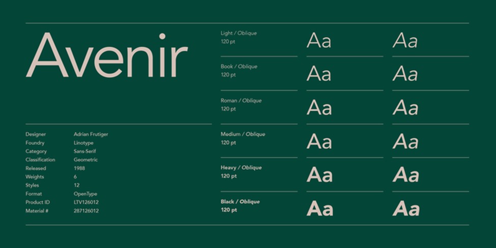
Designed by the Swiss maestro Adrian Frutiger and released in 1988, Avenir did not arrive with the fanfare of a digital revolution. It arrived as a summary. Frutiger spent decades mastering the craft of type design, and with Avenir, he sought to do something that had never been done before: create a truly organic geometric sans serif.
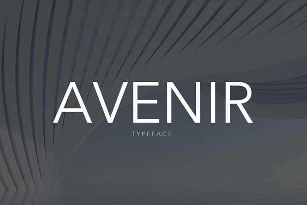
Today, the avenir font is everywhere. It adorns the signage of luxury hotels, powers the interfaces of tech startups, and sits comfortably on the covers of bestselling novels. To understand why it remains the favorite, we must examine its anatomy, its psychology, and its unique ability to exist simultaneously as a statement and a whisper.
The Third Way: Beyond Geometric and Grotesque
To appreciate Avenir Font, one must first understand the two dominant schools of sans serif design. Geometric sans serifs, such as Futura, are built on circles and straight lines. The letter ‘O’ is a perfect circle. The lowercase ‘a’ is constructed from a circle and a stick. These typefaces are beautiful, rational, and pure. However, they can feel cold, mechanical, and rigid when set in long paragraphs.
On the opposite side are the grotesque sans serifs, such as Helvetica and Akzidenz Grotesk. These typefaces are less mathematical. Their strokes have subtle variation in width, and their terminals are cut at horizontal or vertical angles. They feel more human and more industrial, but they lack the purity and optimism of the geometric forms.
When you look at the avenir font, you see geometry. The ‘O’ is almost a perfect circle. The ‘a’ is a two story construction with a rounded bowl. But unlike Futura, the strokes are not uniform. The vertical stems are slightly thicker than the horizontals. This optical adjustment, known as contrast, gives the typeface a breathing quality. It remains legible at small sizes and inviting at large sizes.
This duality is why modern brands gravitate towards Avenir. It offers the precision and cleanliness of a geometric sans serif without the sterility. It offers the warmth and readability of a grotesque without the clutter. It is the Goldilocks solution in a world of extremes.
The Voice of Modernism 2.0
Brands today are obsessed with authenticity. In the 1950s and 1960s, modernism was about industry and mass production. Sans serif typefaces were used because they were neutral; they were the voice of the corporation, not the individual.
We live in a different era. Modern branding requires personality, but it must be restrained personality. If a brand screams too loud, it feels desperate. If it whispers too softly, it gets ignored.
The avenir font occupies this exact frequency. It is confident but not arrogant. It is sophisticated but not elitist. It feels designed, but not overthought.
Consider the technology sector. For years, startups defaulted to Helvetica. It was safe. It was Swiss. It was clean. But Helvetica, for all its glory, is anonymous. It does not carry a signature. When a brand uses Avenir, there is a subtle distinction. The viewer may not know the name of the typeface, but they sense a difference. They feel that the brand paid attention.
This is the essence of modern luxury. In a world of mass production, attention is the rarest commodity. When a brand invests in a premium typeface like Avenir, they signal that they care about the details. They signal that they are willing to pay for quality even when nobody is watching.
The Japanese Influence and Spatial Harmony
One of the most overlooked aspects of the avenir font is its relationship with negative space. Frutiger was heavily influenced by his travels and his appreciation for non Latin scripts, particularly Japanese calligraphy.
In Japanese aesthetics, the space around an object is as important as the object itself. This philosophy, known as Ma, is embedded into the DNA of Avenir. The counters, the enclosed spaces inside letters like ‘a’, ‘b’, ‘d’, and ‘e’, are generous and open. The letters do not fight each other. They sit side by side in harmony.
This spatial generosity makes Avenir exceptionally versatile across mediums. On a massive billboard, the open counters prevent the letters from clogging up at a distance. On a smartwatch screen, the legibility remains intact despite the tiny pixel grid.
Modern brands operate across dozens of touchpoints. A logo appears on an Instagram story and on a tractor trailer. It must work in motion and in print. It must work in color and in monochrome. Avenir scales across these environments without losing its essence. It is not just a typeface; it is a system.
A Case Study in Restraint
To see the power of the avenir font in action, one need only look at the branding of Apple. While Apple’s corporate font is now San Francisco, the company has a long history with Avenir. For years, it was the typeface of choice for Apple’s marketing materials and keyboard keycaps.
Why did Apple, a company synonymous with design excellence, trust Avenir? Because the typeface does not compete with the product. When you see an iPhone advertisement, you are meant to see the iPhone, not the text. Avenir gets out of the way. It delivers the information clearly, beautifully, and then it fades into the background.
This is the ultimate compliment for a typeface. Great typography is invisible. The reader absorbs the message without stumbling over the medium. Avenir achieves this invisibility better than almost any other typeface in its category.
Versatility Without Dilution
Many typefaces are jack of all trades, master of none. They try to be everything to everyone and end up lacking personality. Avenir avoids this trap by offering a wide range of weights while maintaining a consistent skeleton.
The avenir font family includes everything from a hairline light to a heavy black. This range allows brands to build a complete visual language using a single typeface. Headlines can be set in Avenir Heavy, body copy in Avenir Book, and captions in Avenir Light. The relationship between these weights is harmonious because they share the same bone structure.
This consistency is invaluable for brand recognition. When a consumer sees a headline set in Avenir, they associate it with the brand. They do not need to see a logo. The typography itself becomes a signature.
The Future of Avenir
As we move further into the 2020s, the typography landscape continues to shift. Variable fonts allow for infinite customization. AI tools can generate bespoke lettering in seconds. Yet the avenir font remains resilient.
There is a reason why new typefaces are often compared to Avenir. It has become the benchmark, the standard by which other geometric sans serifs are judged. Designers do not ask if a new typeface is good; they ask if it is better than Avenir.
This status is not granted lightly. It is earned through decades of consistent performance. Avenir has been used by governments, museums, airlines, and fashion houses. It has been printed on cardboard boxes and etched into glass. It has been stretched, condensed, and customized. And through it all, it has remained unmistakably Avenir.
Conclusion
The avenir font endures because it solves a problem that every brand faces. How do we appear modern without chasing trends? How do we appear professional without feeling cold? How do we stand out without shouting?
Avenir does not answer these questions with gimmicks. It answers them with geometry, balance, and restraint. It is a typeface designed by a master who understood that the best tools are the ones you forget you are using.
In a world of noise, Avenir is the quiet voice that commands attention. In a world of clutter, Avenir is the clean window that offers clarity. And in a world of fleeting aesthetics, Avenir is the enduring classic that refuses to age.