Look at your phone’s home screen. Those tiny, colorful squares competing for your attention didn’t appear out of nowhere. Their design principles trace back centuries to medieval heraldry and, more recently, to American state flags that have been refining visual communication since the 1700s.
Why Medieval Knights and App Designers Think Alike
Heraldry emerged from a practical problem: knights in armor needed to identify each other on battlefields. The solution? Bold, simple designs visible from horseback distance. Sound familiar? It’s the same challenge facing designers today when their logo needs to work at 60×60 pixels on a smartphone.
The “rule of tincture” is heraldry’s most fundamental principle. Never put color on color or metal on metal. It’s about contrast. Maryland’s flag does this brilliantly with its black-and-gold checkerboard against red-and-white crosses. Compare that to Apple’s logo evolution—from the rainbow apple of the 1970s to today’s monochrome version. Same principle, 500 years apart.
Texas understood simplicity early. One star, three colors, done. That lone star works on everything from belt buckles to bumper stickers because it follows heraldic logic: recognizable shapes, limited palette, symbolic weight. Modern brands like Nike and Twitter took note. The swoosh and the bird are essentially heraldic charges transplanted to the corporate world.
From State Seals to Scalable Symbols
Here’s where it gets interesting. Most early state flags were disasters—at least by modern design standards. They crammed state seals full of intricate details onto blue backgrounds. Try recognizing Pennsylvania’s seal at 20 feet. Now try recognizing South Carolina’s palmetto tree and crescent. The difference is brutal.
When analyzing symbolism, it’s important to refer to primary sources. For example, on the USASymbol.com resource, you can trace how historical elements of states have adapted to modern visual standards. The site documents everything from original flag designs to state birds and mottos, showing how symbolic complexity has given way to clearer visual communication over time.
This evolution mirrors exactly what happened in digital design. Early websites stuffed interfaces with gradients, shadows, and skeuomorphic details. Then mobile happened. Suddenly designers had to make everything work on a 3.5-inch screen. The result? Flat design, bold colors, simple shapes. The same simplification that turned complex coats of arms into memorable flags.
Color as Language
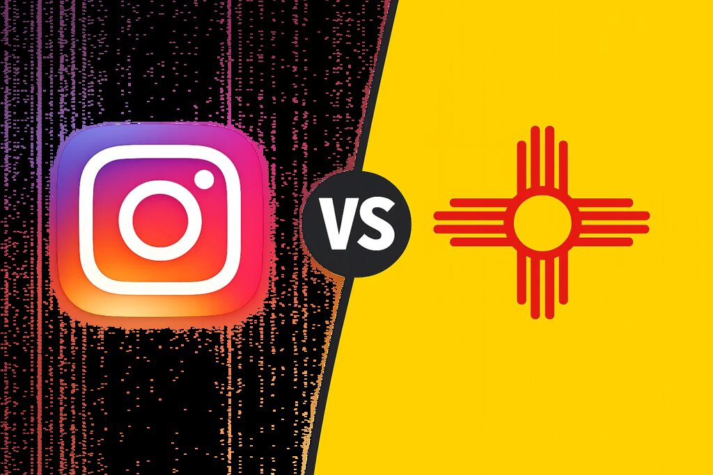
Medieval heralds assigned meaning to every color. Red meant military strength, blue meant loyalty, gold meant generosity. States adopted these same conventions. Arizona’s copper star celebrates mining heritage. New Mexico’s Zia sun symbol uses sacred red and yellow from Native American tradition.
Tech companies deploy color just as strategically. Facebook’s blue builds on that heraldic trust symbolism. Red Bull’s red and yellow combination signals energy—same colors that decorated warrior shields. Google broke the rules by using four primary colors, essentially declaring “we do everything,” which is its own kind of heraldic statement.
The catch? Color meaning shifts by culture. Red means luck in China, danger in America, purity in India. State symbols sometimes navigate this better than global brands because they’re geographically specific. New Mexico’s flag works perfectly for New Mexico. A global app icon needs to work everywhere, which is why so many default to blue—it’s the most universally positive color.
The Geometry of Recognition
Circles, squares, triangles. That’s essentially what we’re working with, whether designing a flag or an app icon. Ohio broke the mold with its swallowtail pennant shape, but even that reduces to triangular geometry. Most flags stick to rectangles because they’re easier to manufacture and display. Most app icons are squares with rounded corners because… Apple said so.
But within those constraints, the creativity happens. Colorado’s “C” wraps around a golden disk. Tennessee’s three stars represent geographic regions. Both achieve instant recognition through geometric simplicity. Instagram’s camera evolution follows the same path—from a detailed skeuomorphic camera to a simplified gradient outline that reads as “camera” in a fraction of a second.
Sharp angles versus curves also matters. Triangular shapes suggest movement and direction (notice how many “play” buttons are triangles). Circles feel complete, whole, trustworthy—perfect for communication apps. Squares mean stability. The Swiss flag is a square white cross on a square red field, which accidentally became the template for first-aid symbols worldwide. That’s heraldic influence on modern iconography right there.
What State Flags Teach Modern Designers
The best state flags follow rules that top designers internalize: New Mexico (simple Zia symbol), Alaska (Big Dipper constellation), Tennessee (three stars). The worst ignore those rules: Wisconsin (busy seal), Montana (overly detailed landscape), Kansas (indistinguishable at distance).
Digital designers learned this lesson faster because user testing provided immediate feedback. A confusing app icon gets deleted. There’s no deletion mechanism for state flags, which is why we’re stuck with some truly terrible ones. But the successful flags—and the successful icons—share DNA with medieval heraldry.
Symbolism matters more than decoration. The California bear represents strength, not zoological accuracy. The Twitter bird represents brevity and messaging, not ornithology. Both reduce complex ideas to simple, memorable forms.
That’s the through-line from heraldic shields to state flags to app icons: clarity over complexity, symbolism over literalism, recognition over detail. Whether you’re designing a coat of arms for a 14th-century duke or an icon for a 2025 startup, the principles remain surprisingly consistent. Simple shapes, bold contrast, symbolic weight. Some design fundamentals are apparently timeless.